Your comparison was very well presented, and showed a clear understanding of the task and key media concepts. Your analysis is of a very high standard, especially the deconstruction of technical aspects. Well done, Tom.
Wednesday, September 30, 2009
Tuesday, September 29, 2009
Wednesday, September 23, 2009
Opening Sequence Comparisons
Comparing the opening sequence of 'Legally Blonde' and 'Seven'
Legally Blonde
Shot Types
- ECUs on different parts of main character - she is revealed bit by bit
- Occasional LS to get a feel for the area that the film is set in
- MS of the main character at the end to clearly show her to the audience
- CU shots of her materialistic possessions such as the Prada bag to show her wealth
- Overhead shots of the campus give us more of a sense of where this movie is taking place and helps establish the film
- Hobbies and Personality of Main Character revealed through the many possessions shows in the opening sequence
- Name of main character is revealed on the card that is passed under her door
- Looks very popular due to her many friends that rush to sign her card
- Everyone is wearing pink and are all doing make up which strongly suggests that they are all very 'girly girls'
- Everyone seems to be extremely wealthy due to the large house they are in and the posh looking area that they are in
- Upbeat music suggests that this is probably going to be a lively, fun film
- Shot of main character's boyfriend at the end shows that the narrative will probably be focused around relationships
- probably a very stereotypical film due to the characters already shown
Seven
Shots
- Initial LS inside to establish the setting of the house
- MS of two main characters so they are instantly recognisable and some of their personalities can be revealed
- CU of some of Morgan Freeman's personal possessions such as his glasses and metronome, these show that there is something different/mysterious about him
- LA shot showing Morgan Freeman and Brad Pitt walking with rain pouring down, audience aren't on the same level as the characters and having the rain pour down on the audience creates a sense of misery
- Freeman seems very isolated from everyone else, he is told that people don't want to be working with him anymore
- Wearing a trench coat which shows he is just like an old fashioned detective
- His morning routine is shows which shows that his character is very precise and likes to do things in a particular way
- Brad Pitt is wearing very casual clothing and chewing gum, shows he probably has a relaxed personality
- The way in which Pitt speaks to Freeman shows he has a lot of confidence
Narrative Expections
- Clips of newspaper filings and photos suggesting a murder mystery
- All colours are very grey and dark which hints that this could be a dark miserable film
- Most of the opening sequernce is silent which creates an eerie feel to the film
- Some inital conflict between Pitt and Freeman suggesting there may be more further in the film
Overall Comparison
'Seven' and 'Legally Blonde' both are completely different opening sequences. 'Legally Blonde' shows a bright, happy, almost unrealistic world where every boy and girl are ahppily getting along. From this it is easy to see that this film will be very lighthearted and joyful. 'Seven' starts off with dark miserable colours with a lot of silence which connotes an eerie depressing film. This contrast in the opening sequences is essential because both films are different genres. The genre of thriller/mystery comes across extremely well in 'Seven' and 'Legally blonde' is easily identified as an upbeat girly comedy.
Monday, September 21, 2009
Horror Still Analysis
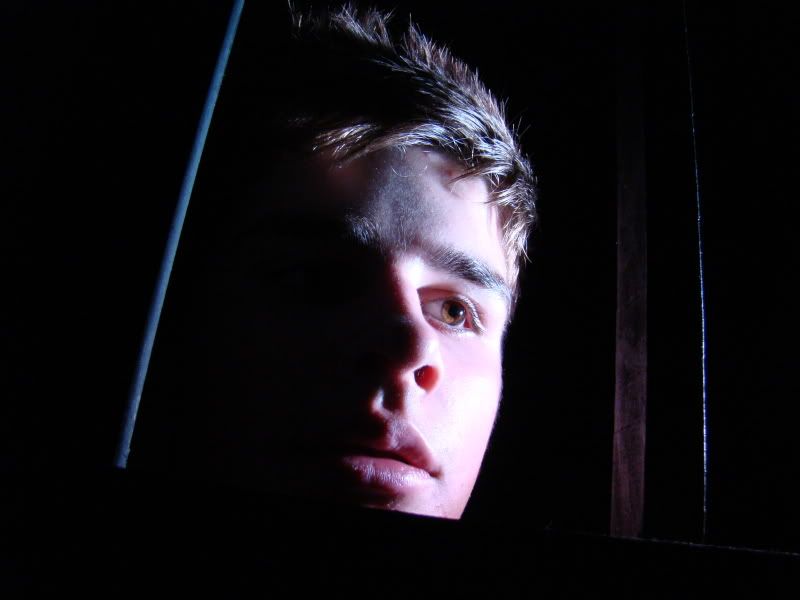 This shot is a CU of a male figure. He is looking away from the camera as if there was something to be worried about. It represents horror in many ways. the photo has quite an extreme quality about it; the lighting on his face and the framing of the shot. This limited lighting does just enough to show his facial expression but hides a lot creating mystery in the character. Although the character is fairly central and takes up most of the shot there is still some space around him to create an eery feel for the space he is in.
To achieve the horror effect many factors were carefully considered. The lighting has extreme contrasts within the shot. One side of the models face is lit up while the other half and background are completely dark. The framing is a CU which allows us to see the scared expression on the models face. there is also a slight tilt to the framing to represent abnormality within the shot. To achieve this tilt the camera was taken off the tripod and i had to use it carefully with a steady hand. Although it is slightly unclear, there are bars in the shot around the models face. this gives a sense that the model is trapped and creates more fear. Some zoom had to be used on the camera to get close enough to his face so his expression can be clearly conveyed to the audience and i had to crouch in order to get a bit of LA on the shot.
There are many things i like about this particular shot. I think the framing is perfectly balanced. The CU shows his face and emotion really well and leaves enough space for the dark areas around the model. the lighting on this shot is also very effective in my opinion. It lights up half of his face only so a sense of mystery is created. It also contrasts the light and dark really well so an element of extreme is created which further signifies the genre of horror.
If I were to do the shot again there are a few things i would change. Firstly i would try and the light to focus on the bars as well as the models face. This would show more clearly that the person in the shot is trapped in a frame within a frame already. I would also try and get the model to use a more extreme expression so it is clear to the audience that this person is scared and trapped. I may also change the framing slightly so that theres is even more tilt on the frame in order to make the shot stand out and more horror-like.
Subscribe to:
Posts (Atom)