Final sequence

Preliminary Trask

Showing posts with label BLK. Show all posts

Tuesday, October 6, 2009

Decontructing a Continuity Sequence


This sequence starts with an OTS shot of Dale. He is then shown reaching into the drawer. The camrea then switches to a LS of the room. There are many continuity techniques in this shot. The first the use of match on action. From the OTS as he reaches he then continues to reach in the LS. This LS also establishes the room that they are having this conversation so the audience can really feel where this scene is taking place. This LS also becomes a master shot for this particular sequence.

The sequence then focuses back on the two main characters. There are constant OTS shots switching between Dale and Brennan. These always focus on the person talking so the audience can make the most of each character's movements and they're able to see the exact expressions. This technique is a shot reverse shot technique. It works well in the sequence to keep continuity because it keeps the conversation alive and both both sides of the sequence are shown.

Continuous examples of match on action continue throughout. It then switches back to a master shot. Switching back to this master shot is extremely useful because it reminds the audience of the purpose of the scene and the place. Without it the constant shot reverse shot process could become tedious and lack meaning to the viewer.

The shot after shows Brennan rising up out of his seated position and grabbing something from the shelf. As he does this the camera pans to the right in order to follow him. This keeps the structure of the sequence similar but shows the audience what is happening in order to develop their understanding. As he sits back down the camera switches to behind him again. It follows him back down in a slight crab shot motion. The end position is in the original OTS shot position. These shots are very useful for creating continuity because they almost imitate the character's movements in order to show flow within the sequence.

Throughout this scene continuity rules aren't broken once and all the techniques are used in order to create flow in this scene. The 180degree rule is stuck to throughout and no jump cuts are used. This all makes the editing process seem invisible and really helps the audience follow the film perfectly.

Tuesday, September 29, 2009

Analysis Of Continuity Sequence


The point of this activity centered around trying to put together a 6 shot continuity sequence with the theme of an accident. We had only been taught very few rules and tips so it was interesting to see how well our continuity sequence would have worked.

There were not many things in this sequence that worked well. One to point out are the shot where the actor walks into the pole. It is fairly humorous and is framed well. The shot of the girls talking is also individually framed however it did not fit into this continuity sequence. Many ideas could have been shot well in this sequence but due to a lack of experience, a lot went wrong.

The first two shots in this sequence demonstrate a big mistake. The camera jumps from framing a MS to framing a LS even though the actor is walking forwards. This creates the impression he has also jumped backwards whereas we were trying to show him walking forwards. The transition also isn't smooth enough. The MS to a LS doesn't flow very well due to the large difference in framing. The third shot of the girls doesn't work well in this sequence since they just seem to appear and seem to have no relevance. This could have been fixed with an establishing shot beforehand to set the scene. The crab shot that is meant to be from the boy's point of view again doesn't work due to a lack of information to the audience. The shots seem to be jumping randomly across the area. A master shot should have been in place to anchor the meaning of the scene to the audience. The last shot again makes no sense because it is difficult for the audience to tell that we were filming from the boy's point of view. Many techniques could have been added
to make this 6 shot sequence flow more. An establishing shot at the beginning would be a big improvement, some shot reverse shots to get an idea of the main character's position and cutaways would have been used to break up the action.

From this task i have learnt almost everything that can't be done in continuity shots and all the rules that shouldn't be broken eg. 180degree rule, the need to work in steps etc. It has also taught me which key elements need to be in continuity shots in order to make them flow and seem interesting to an audience.

Monday, September 21, 2009

Horror Still Analysis

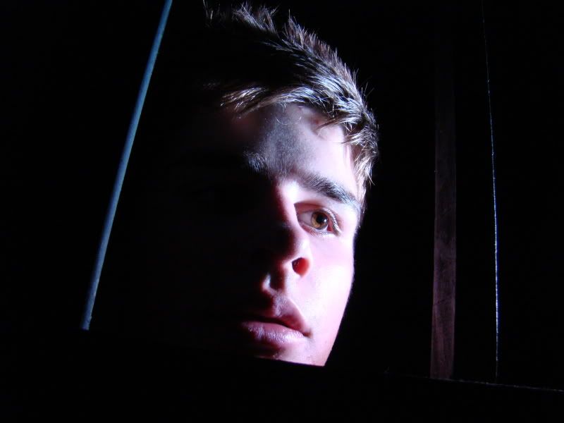
This shot is a CU of a male figure. He is looking away from the camera as if there was something to be worried about. It represents horror in many ways. the photo has quite an extreme quality about it; the lighting on his face and the framing of the shot. This limited lighting does just enough to show his facial expression but hides a lot creating mystery in the character. Although the character is fairly central and takes up most of the shot there is still some space around him to create an eery feel for the space he is in.

To achieve the horror effect many factors were carefully considered. The lighting has extreme contrasts within the shot. One side of the models face is lit up while the other half and background are completely dark. The framing is a CU which allows us to see the scared expression on the models face. there is also a slight tilt to the framing to represent abnormality within the shot. To achieve this tilt the camera was taken off the tripod and i had to use it carefully with a steady hand. Although it is slightly unclear, there are bars in the shot around the models face. this gives a sense that the model is trapped and creates more fear. Some zoom had to be used on the camera to get close enough to his face so his expression can be clearly conveyed to the audience and i had to crouch in order to get a bit of LA on the shot.

There are many things i like about this particular shot. I think the framing is perfectly balanced. The CU shows his face and emotion really well and leaves enough space for the dark areas around the model. the lighting on this shot is also very effective in my opinion. It lights up half of his face only so a sense of mystery is created. It also contrasts the light and dark really well so an element of extreme is created which further signifies the genre of horror.

If I were to do the shot again there are a few things i would change. Firstly i would try and the light to focus on the bars as well as the models face. This would show more clearly that the person in the shot is trapped in a frame within a frame already. I would also try and get the model to use a more extreme expression so it is clear to the audience that this person is scared and trapped. I may also change the framing slightly so that theres is even more tilt on the frame in order to make the shot stand out and more horror-like.